The Impact of Color Psychology in Home Design
The colors in your home do more than look good. They shape how you feel, think, and move through each space every single day.
Color is one of the most powerful tools in interior design, and it is also one of the most underestimated. Most people choose paint colors based on what looks nice in a swatch, without realizing that the colors they live with every day have a real and measurable effect on their mood, energy, and even sleep. Understanding color psychology in design helps you make intentional choices that go beyond aesthetics and actually improve how your home feels to live in.
What Is Color Psychology in Interior Design?
Color theory in interiors is the practice of using color intentionally to shape the emotional atmosphere of a space. Each hue carries associations that are both universal and personal. Some of those responses are hardwired, like the way soft blues tend to slow the nervous system, or how bright reds stimulate appetite and energy. Others are shaped by culture and personal memory. A good designer works with both layers.
Color is not just about the hue itself. Tint (adding white), shade (adding black), and tone (adding gray) all dramatically shift the emotional read of a color. A deep forest green feels grounded and sophisticated. A pale mint of the same base hue feels airy and fresh. Knowing how to work those variables is what separates a thoughtful color scheme for home from a random one.
The Emotional Impact of Colors, Room by Room
Here is how the most common interior colors tend to behave, and where they work best in the home.
Tint, Tone, and Shade: Why the Same Color Can Feel Totally Different
One of the most practical takeaways from color theory in interiors is understanding how tint, tone, and shade change the way a color reads in a room. A saturated cobalt blue on a bedroom wall can feel jarring. The same blue pulled toward a soft powder with white added becomes genuinely restful. Knowing this saves a lot of costly repaints.
Tint adds white to a hue, softening and brightening it. Good for creating airiness and calm.
Shade adds black, deepening and grounding the color. Useful for drama and warmth, but requires sufficient light.
Tone adds gray, reducing vibrancy. This is how you take a color that might feel overwhelming at full saturation and make it livable and sophisticated.
This is especially relevant for homeowners in the Austin area, where the quality and intensity of Texas light means colors often read differently here than they do on a paint chip or in a showroom. What looks like a soft sage in a dim showroom can read almost neon on a south-facing wall at noon. Our furnishings and design team always tests colors in context before committing.
Choosing Color Schemes for Each Room
The most effective color schemes for home are built around how each room is used and how you want to feel in it. A bedroom calls for a different emotional register than a kitchen. A home office has different needs than a playroom.
Living rooms benefit from colors that feel welcoming without being overstimulating. Warm neutrals, soft greens, and dusty blues all work well here. Accent colors in furnishings and textiles let you introduce personality without permanently committing the walls to a bold choice.
Kitchens and dining rooms respond well to warmth and energy. Earthy terracottas, soft yellows, and warm whites keep the appetite up and conversation flowing. If you love the idea of a bold color, the kitchen or dining room is often the best place to try it.
Bedrooms are where the science of mood-enhancing decor matters most. Cooler, softer hues like dusty blue, lavender, and sage green genuinely support better sleep. Avoid anything too saturated or warm in a room where you need to wind down.
Home offices benefit from colors that support focus without inducing fatigue. Mid-tone blues and greens are consistently effective here. Avoid stark white, which can cause eye strain over long sessions, and avoid warm reds, which tend to raise energy in a way that makes sustained concentration harder.
Color in Custom Builds and Renovations
If you are planning a custom home build in Lakeway, Driftwood, Byker Woods, or anywhere in the greater Austin area, the color conversation starts earlier than most people expect. The orientation of each room, the size and placement of windows, the flooring materials, and the ceiling heights all affect how color will read. Getting that input early means your palette and your architecture work together rather than against each other.
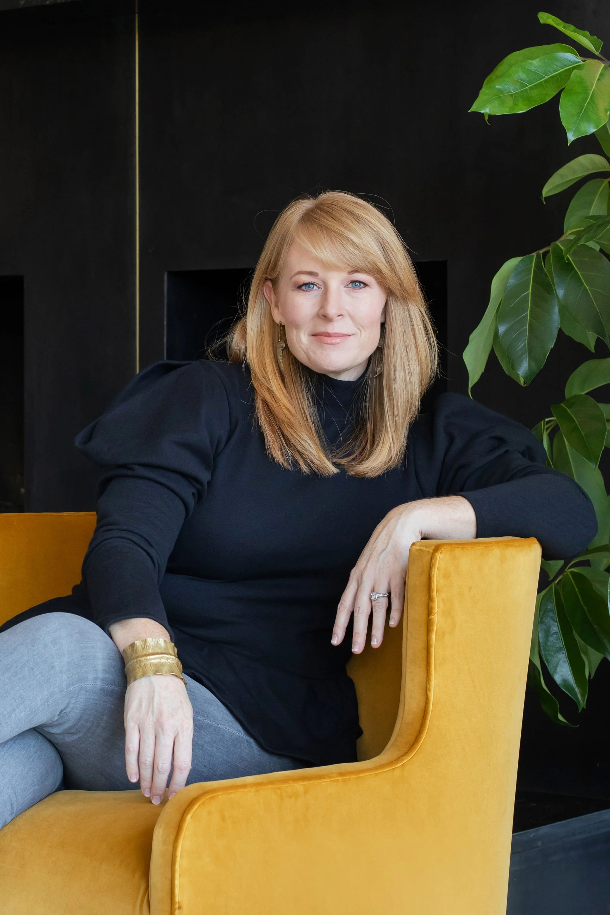
For renovation projects, color is often the highest-impact, lowest-cost change you can make. A room that feels dated, heavy, or uninspiring can be completely transformed with a thoughtful repaint and updated furnishings. We work with clients across the Austin area to develop color plans that reflect their personal style while applying the principles of color psychology in design to every decision.
If you are ready to take a more intentional approach to color in your home, we would love to help. Reach out to schedule a consultation.